The New Website is here
Built for the social web
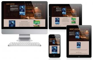
The official website of Kent Lester has been redesigned to take full advantage of social networking and social media. Author’s websites are taking on greater significance as readers move more and more of their reading to tablets and phones. Unlike a paperback, when your writing is viewed on a tablet, smartphone, or e-reader, your website is only one click away. The message of your story can be easily enhanced with supplemental information that evolves digitally over time. Readers can be engaged in new and inventive ways.
Videos, animations, and apps can enrich the reading experience for novels and nonfiction. This “synergy” has already been leveraged by television and movies, which have used the Web to build interest and loyalty in their brand.
To build brand loyalty with fans, authors need to reinvent their websites. It’s not enough anymore to have a “brochure site” or graphics heavy site driven by Adobe Flash. Your site must be interactive and easily shareable on today social media sites like Facebook, Twitter, and Tumblr. Share buttons make it easy for visitors to your content to share it with other friends.
The modern website must also be viewable on today’s mobile devices. That means that your content must fit screens with small real estate and have readable font sizes. The new term for this type of functionality is Responsive Web Design. In other words, the content on the page is formatted in such a way that it can respond to the size of the display device and reorganize itself for maximum readability. Readers should be able to peruse your site without having to zoom into the content. Remember, in today’s mobile world, your site is only a click away from a valued reader, anywhere, night or day.
Thanks to advances in HTML and CSS, the requirements for a responsive web design have gotten a lot easier. Media queries in CSS allow websites to sense the size of the display device and offer up different formatting based on the best design principles. In fact, this website is based on responsive design.
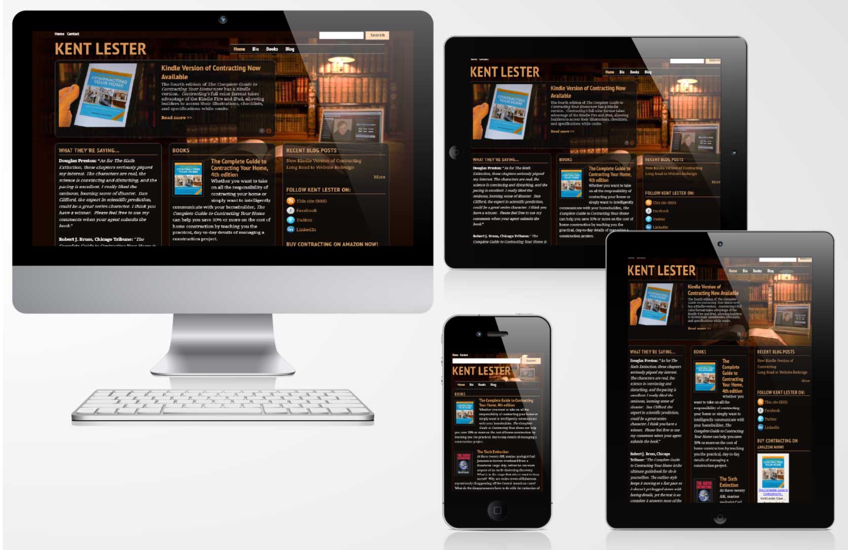
When redesigning my website to market my books, I wanted a design that imitated the traditional graphics heavy designs of other authors, but would do it in a responsive way. Luckily, the web design software I use, Drupal, makes that redesign far easier than in the past. There are complex issues, like how to display background images in different sizes based on the device. Graphics heavy sites can drag down the performance of smartphones with their limited bandwidth. But for the most part, these issues can be addressed. Try out this site on your smartphone or tablet and see how these issues were solved.
Responsive design, like the mobile marketplace it addresses, is improving at light speed. New functionality is being created weekly. If you want to maintain your readership in this new digital world, now is the time to move to the mobile web. The next generation of readers will expect nothing less.

Kent Lester writes fiction and non-fiction in a variety of subjects, including science, construction, the art of writing, social media, the Drupal content management system, complexity science, and the future. This blog may contain posts on some or all of these subjects.
Recent content
- 1 hour 46 minutes ago
- 5 years ago
- 5 years 4 months ago
- 5 years 4 months ago
- 5 years 4 months ago
- 5 years ago
- 5 years ago
- 5 years ago
- 5 years 6 months ago
- 5 years 6 months ago
Archives
- December 2015 (1)
- June 2016 (1)
- February 2017 (3)
- April 2017 (6)
- September 2022 (1)
Copyright 2017 by Kent Lester